Home and the Heart: reflections on color
This was a book I created to contain the many studies and explorations that I did of the hue, red-orange, for a class on color at Pratt Institute. We spent a lot of time mixing paint, creating swatches, and photographing our color as we found it in nature. The book was intended to tie these studies together in a sort of narrative of exploration.
Objective: Design a book that fully explores a personalized experience of the color red-orange. Using narrative, photographs, and a series of painted exercises, various harmonies and studies are presented in a way that enhances the viewers understanding of the hue.

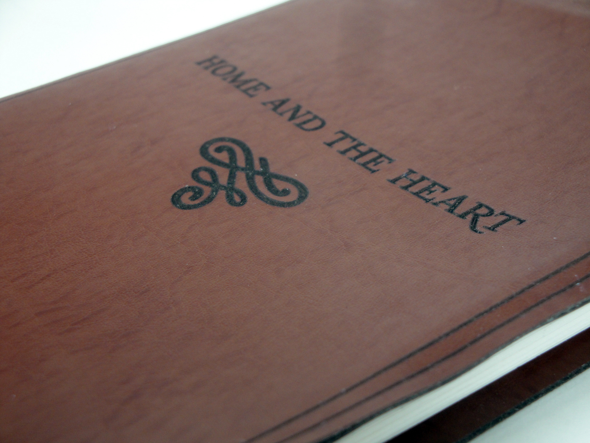
Leather-bound, engraved cover of the journal-like book.

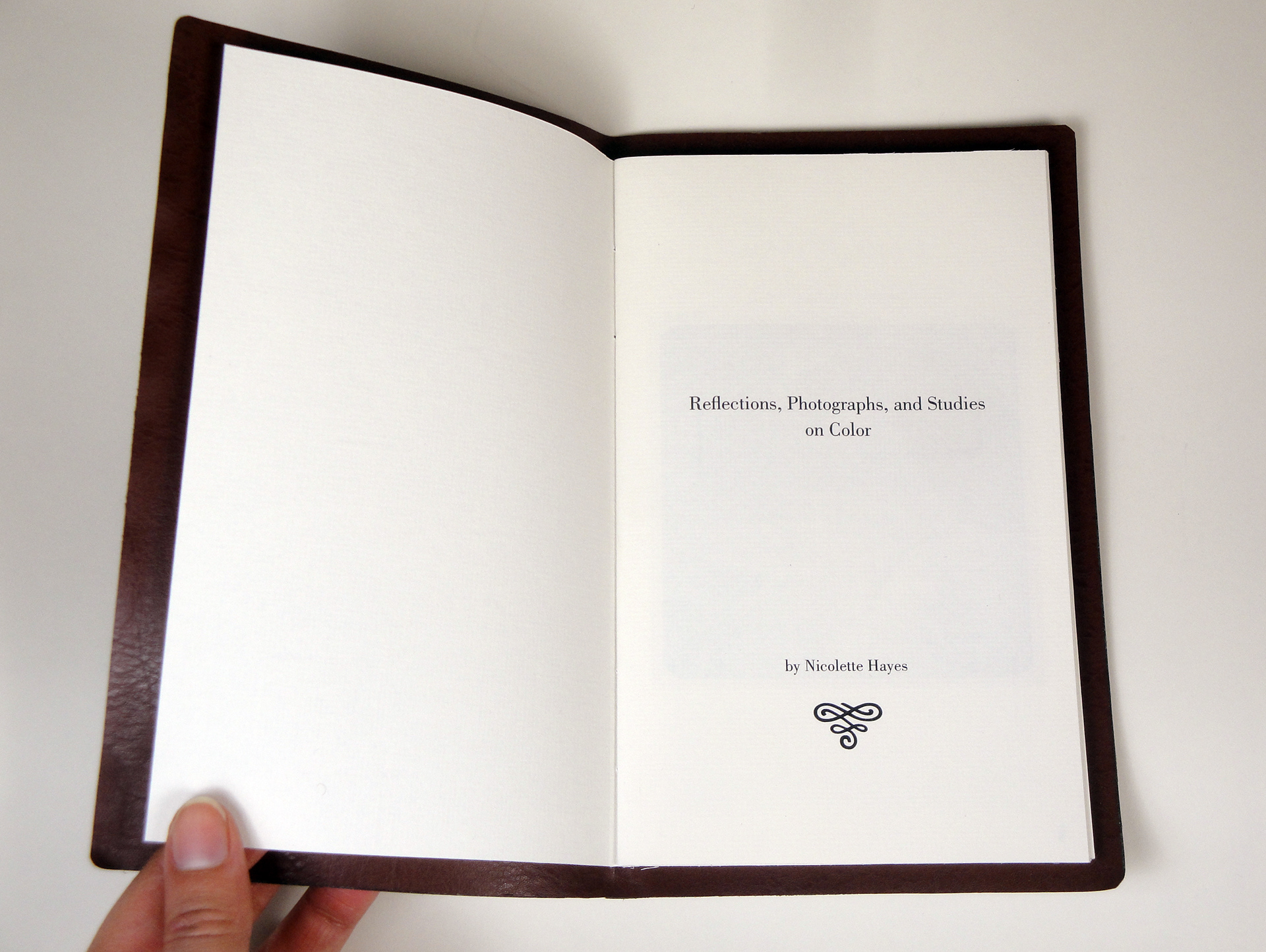
Title page in the style of old-timey scientific volumes

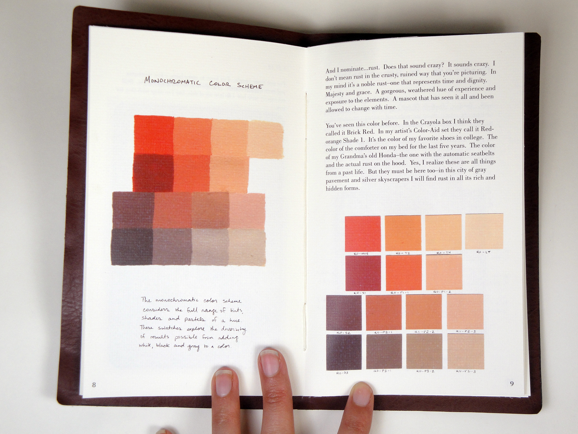
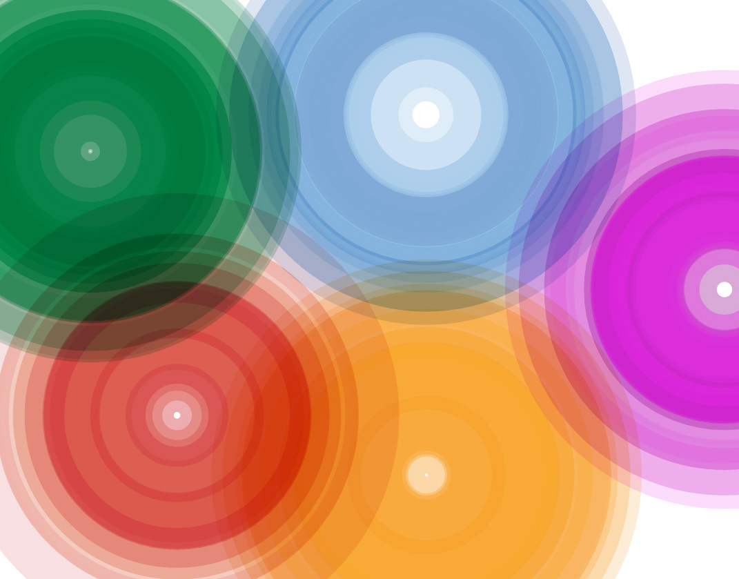
The monochromatic color spectrum in both painted and collaged swatches.

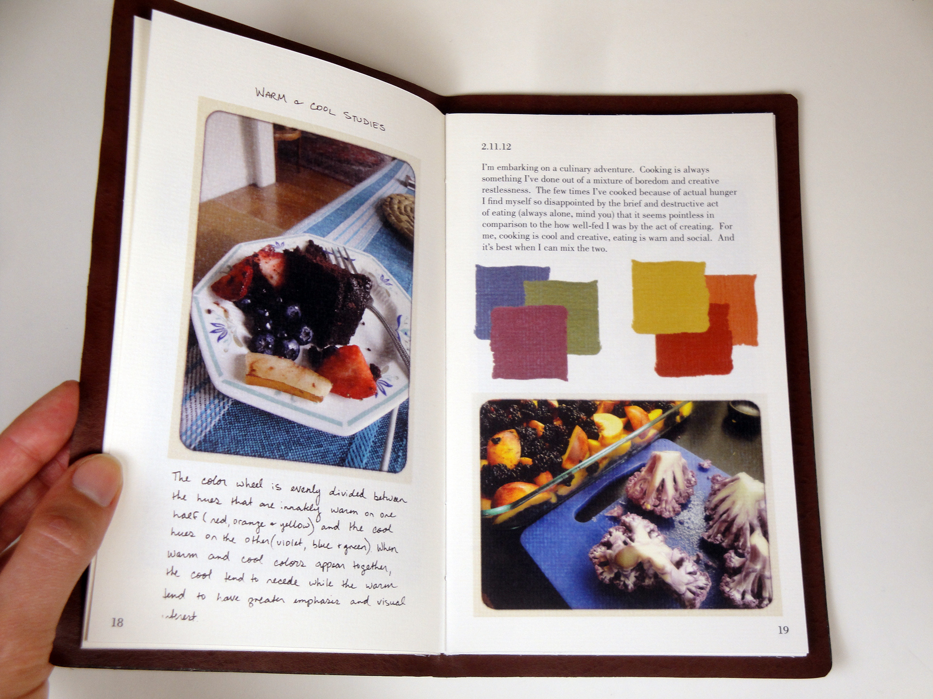
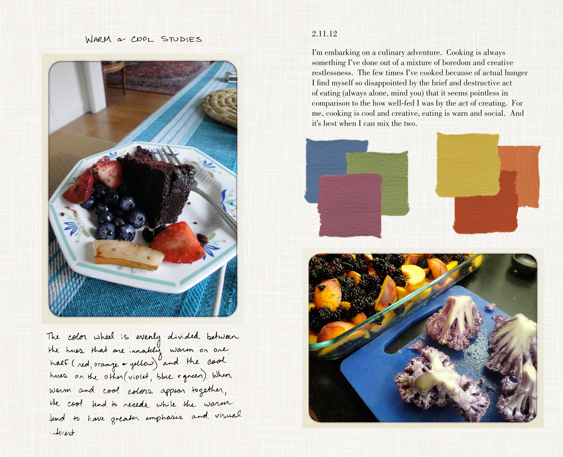
Photographic studies of warm and cool harmonies.

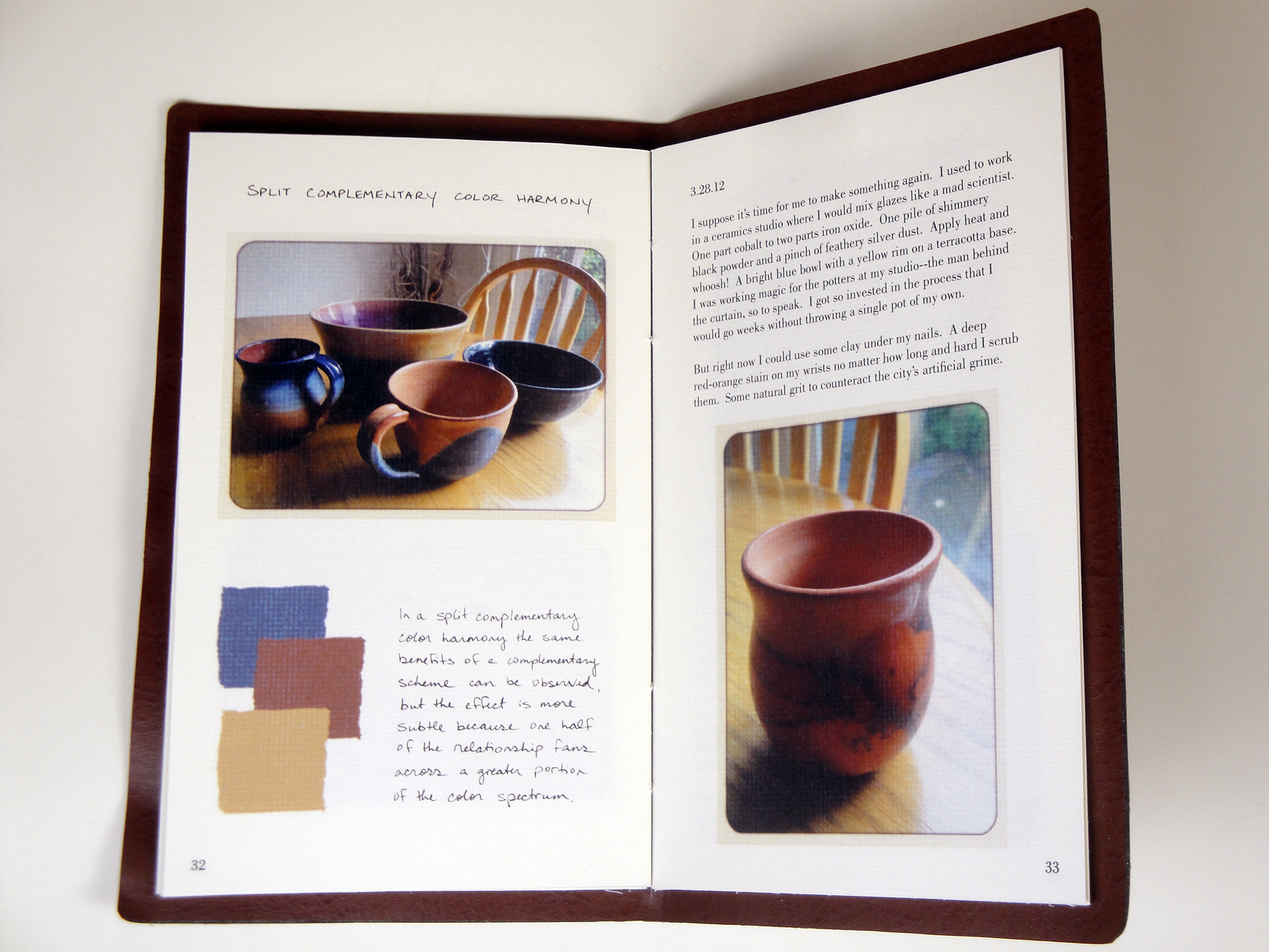
Photographs of ceramics created to display a split complementary color harmony.
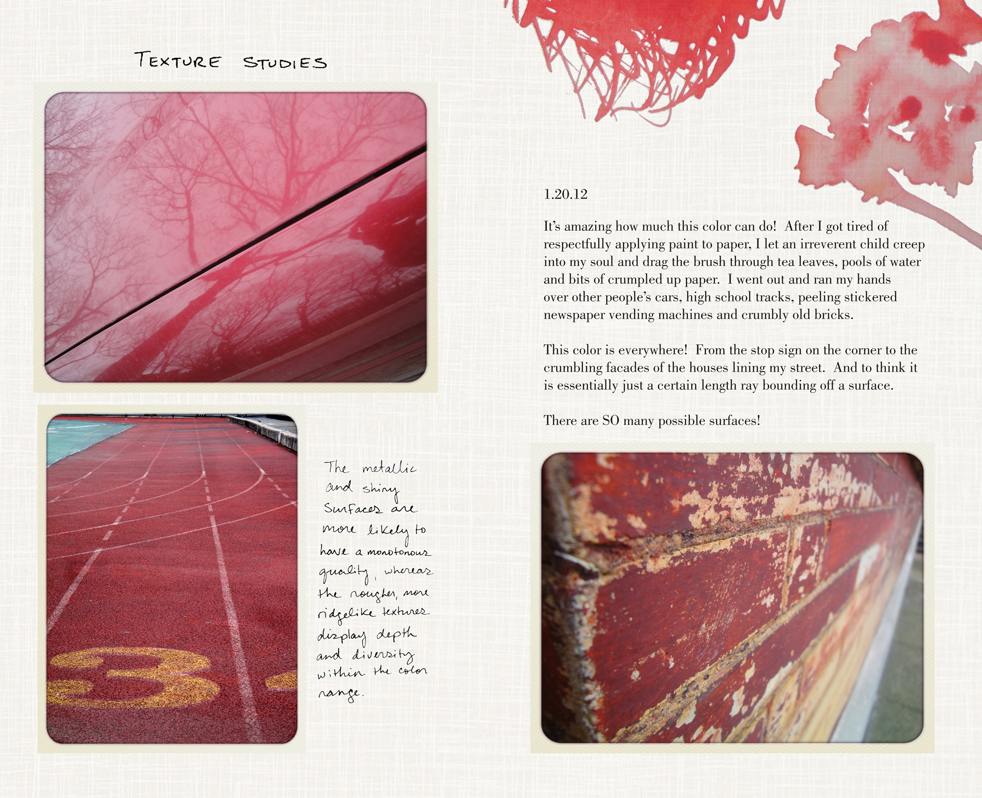
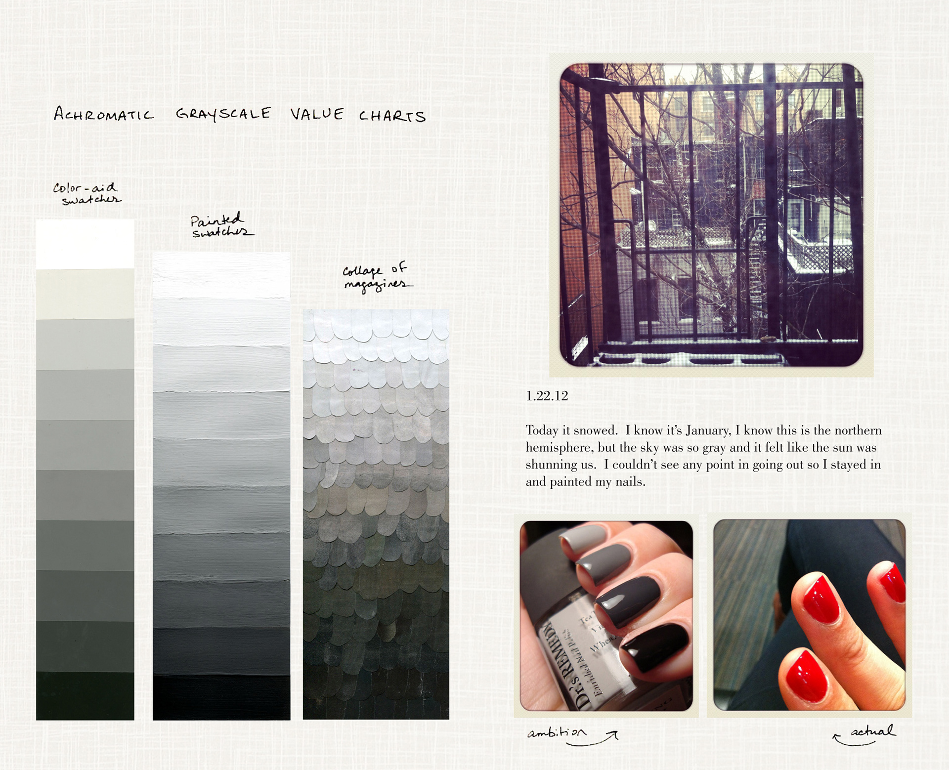
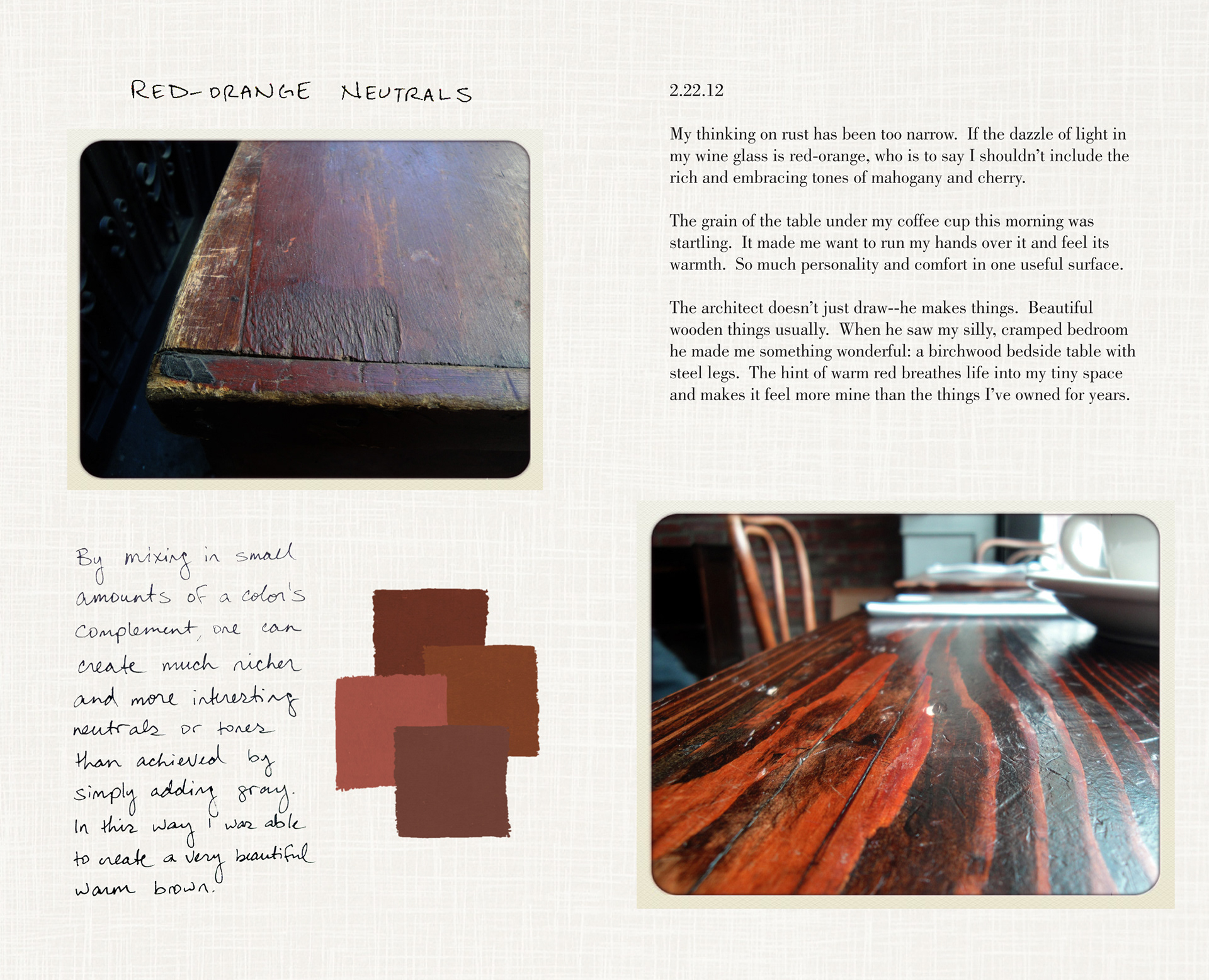
Additional layouts from the book:


You may also like
Gotham Inc.
Art Direction, Interaction Design, Print Design,
American Panorama
Web Design, UI/UX, Interaction Design,
Folio Magazine
Art Direction, Editorial Design, Interaction Design,
Rebranding the Lower East Side: typographic animations
Animation, Branding, Web Design,
New York Botanical Garden
Branding, Digital Photography, Graphic Design,
Amazonia Under Threat
Web Design, UI/UX, Interaction Design,
Manhattan Recipes: cooking in motion
Animation, Directing, Motion Graphics,
Slow Mode
Branding, Graphic Design, Interaction Design,
Steal This Conference
Art Direction, Interaction Design, Print Design,